

DAFFODIL / brand identity & packaging design
objective:
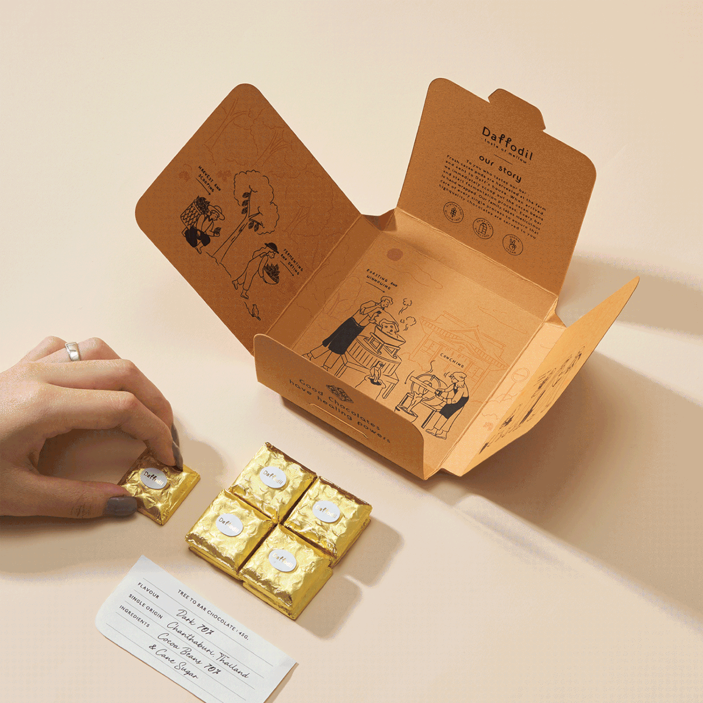
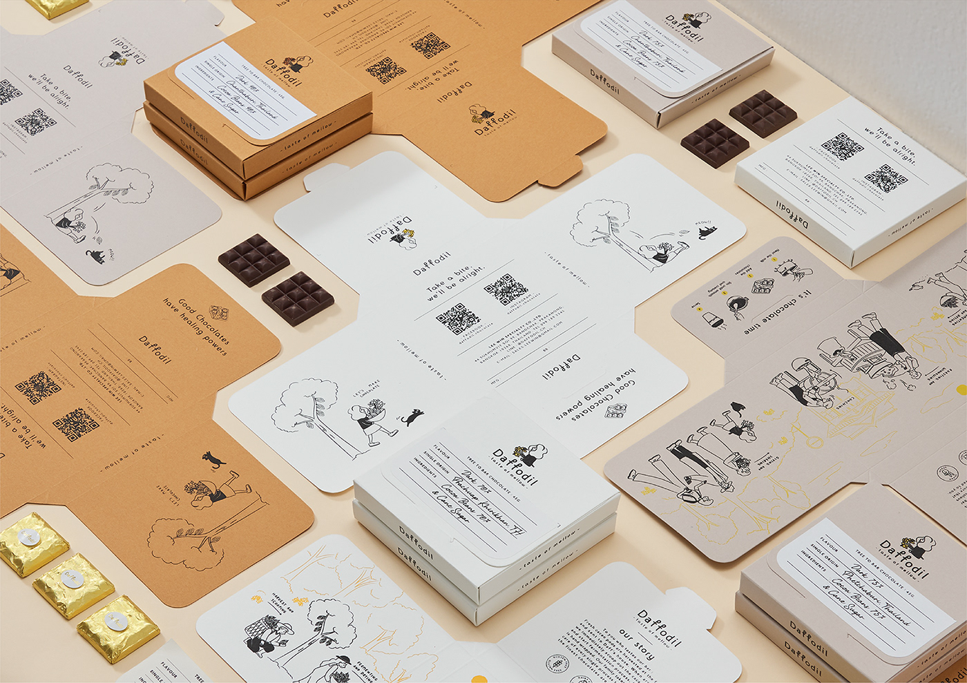
The brand tells a story about the origins of chocolate through a girl character.
From the planting to the manufacturing processes, the value of Thai produce, Thai farmers, and the desire to make the best chocolate for everyone are promoted.
design concept:
The origins of the brand are told through a logo depicting a girl confidently committed to chocolate while holding a flower (daffodil). The symbolic meaning of the daffodil is that it is the first flower to bloom in the spring. To bring good news that is about to occur, which is appropriate for the start of a new day and new stories are auspicious symbols.
A character design of a girl holding a daffodil flower with a simple illustration style that is suitable for all ages. Everyone is introduced to the taste of chocolate craft in the story. The packaging design gradually reveals the concept of chocolate making. It's like watching a short visual story that catches everyone's attention.


AGENCY :
Andon Design Daily Co.,Ltd.
CREDIT :
Design Director by Pongtorn Wachirapoka
Designer by Wannaporn Bangsuanluang
Illustrator by Wannaporn Bangsuanluang
Photographed by Parinya Kawsrito
VIA :
https://www.facebook.com/daffodil.chocolate
https://www.instagram.com/daffodil.chocolate/
Copyright © Andon Design Daily Co.,Ltd. All Rights Reserved.


